How did I use the new Rounded Borders feature in #PowerBI Desktop to make shaded charts
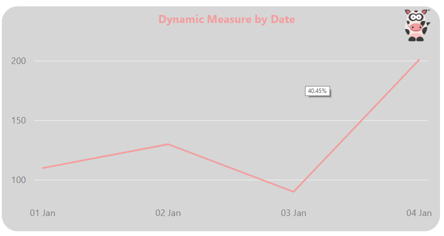
In this blog post below, I am going to show you how I used the new Rounded Borders feature to create shaded charts with rounded borders as shown below.
I used the new Rounded Borders feature that was released Power BI Desktop – Feb 2019 Rounded Borders
This is what it looked like once I had completed the following steps below the image.

-
This is what the chart looked like before I made the changes above.
-
In order to make the changes I went into the Format options for my chart
-
I then toggled the Background from Off to On
- I then selected my Grey Colour.
- I then set the Transparency to 60%

-
At this point my chart looked like the following (A little better but not quite there)
-
I then went to the Border option and changed then toggle from Off to On
- I set the colour to white
- I then set the Radius to 20

-
This was now looking almost perfect.
-
Because the report was going to be used on a big screen, I wanted to ensure that the company branding was on the report.
- I then added my company logo onto the chart.

I now had got the result that I wanted using the new Power BI Border Radius feature.
As I have demonstrated above, this new feature makes it easy to change the way your reports are viewed and possibly get a bit more interaction from other users.
As always thanks for reading and if there are any suggestions or comments please leave them below.


